Zenbus
Zenbus is a real-time transport localisation service. However their mobile application did not offer a good user experience, so during a school project we had to rethink their application and create new features.
- 🕒 Duration : November - January 2019
🤹 Skills : Product Design - User Experience - User Interface - Prototyping
🔧 Tools : Sketch - Principle - Maze - Trello
🤝 Team : Victor Ducrot - Antoine Cesbron - Bastien Adam - Théo Monnin
🏆 Award : Zenbus' firm favourite
Overview
Zenbus is a service that offers the possibility of locating public transport in real time. Cities equip their buses and tramways with a GPS tracker and allow their inhabitants to locate them on the Zenbus application, to avoid missing them. Useful on a daily basis, the application is even more useful on long lines, during disruptions or even during work on transport networks.
However, in 2018, their design team regrets many defects and negative feedback on their application from their users. I worked with 5 great teammates to propose modifications to improve the user experience. Today, the application integrates our new features since February 2019, to the great delight of users!
Research & Understanding
In order to identify the problems present in the current application, we have defined the user flow from the launch of the application until we know the exact time in which our bus will spend at our stop. This is the main action, that the users who go to the application, do every day.
The current path to do this action is done in the following steps:
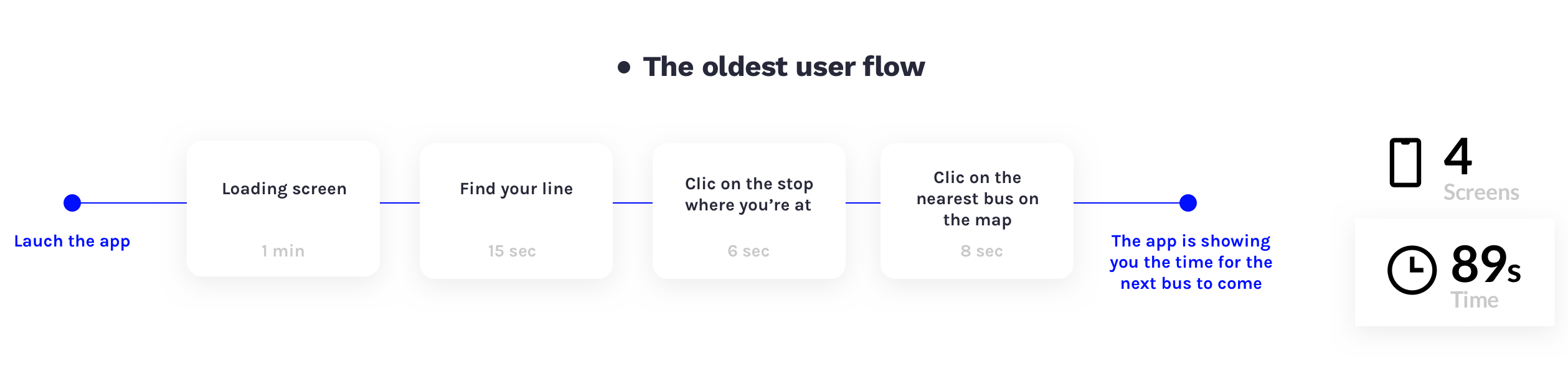
The average time to make this request is about 2 minutes, which is precious time when you are not sure whether your bus has passed or not, leaving for work in the morning. With such a long and laborious route the user is discouraged and the application becomes ineffective, so you better use your 2 minutes to run to the stop and hope our bus hasn't passed yet.
Challenges
• Reduce loading time at application launch
• Reduce the number of clicks to find the bus you are looking for
• Make map and information more understandable on the main screen
My Role
I worked as a product designer on this group project: the product thinking (creation and prioritization of the features), the ergonomy (layout, organization, architecture), the interactions (animations, transitions and how they influence the experience) and the global visual design of the app.
The Solution
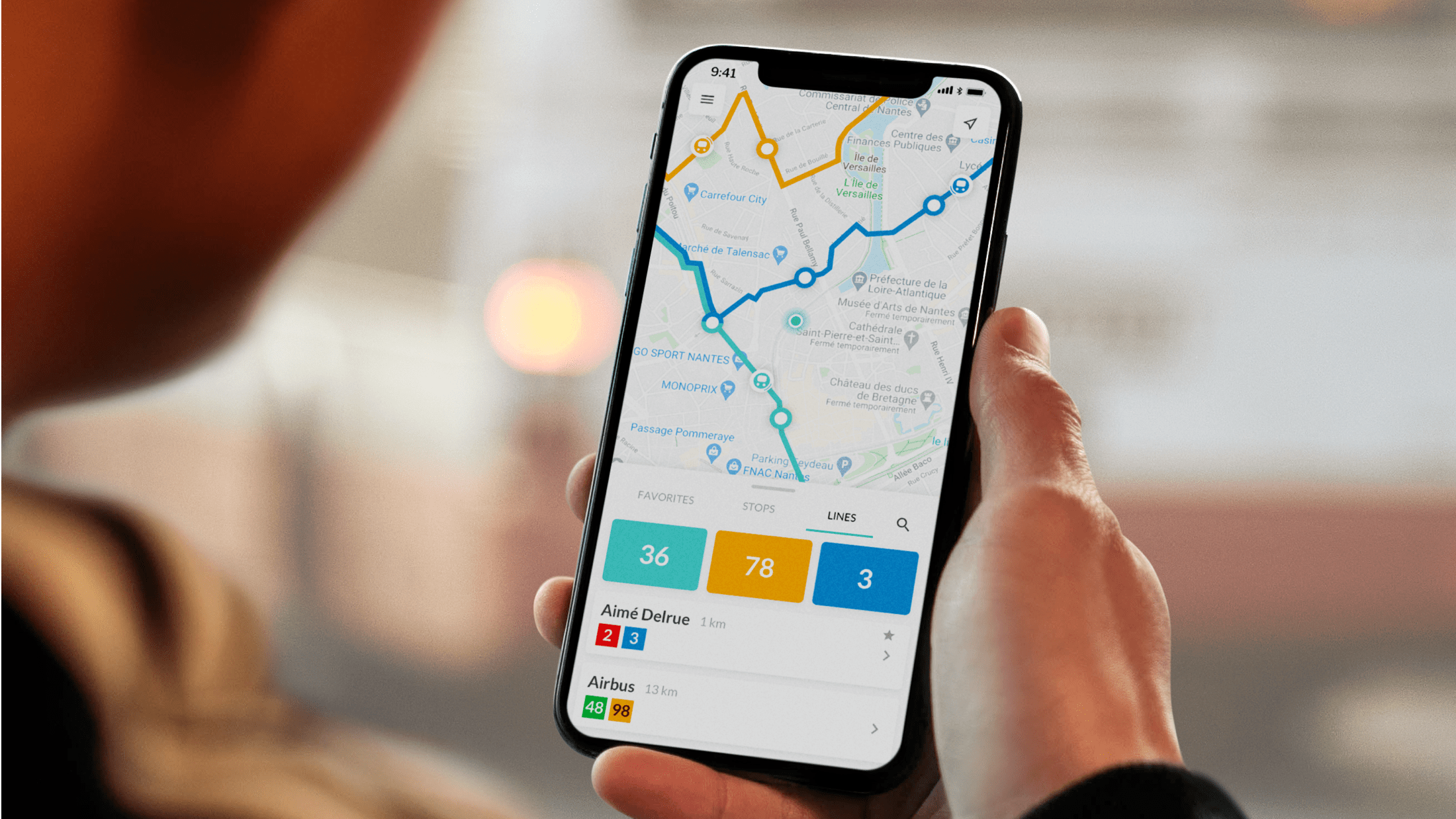
The aim is for the user to quickly find the time when his bus will pass at his stop. The interfaces should be simple and the navigation more intuitive with a reduction of the steps of use to get to the information.
We have developed 3 features to solve these problems:
• 3 states bottom sheet to display more or less information
• Favorites tab to personalize the experience
• Line tab and stop tab to display only relevant content on the map
The Process
For this project we used the agile method, it allowed us to collaborate more efficiently and to be able to adapt our features to the feedback from the client and the end users. The sprints lasted 20 days, during each sprint we focused only on one feature to be able to achieve it fully.
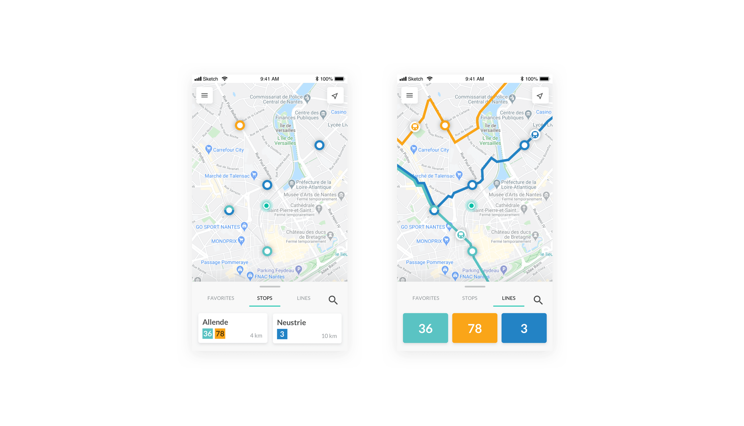
The bottom sheet - 1st sprint
The complementarity between bottom sheet and map is essential for a good display of information. To select our line we have to scroll in a bottom sheet that takes up 30% of the screen. This is not convenient because there is a lot of information in little space, the upper part is then occupied by the map which we do not use when we are looking for informations in the bottom sheet.
To solve this problem we have chosen to make a bottom sheet in 3 states so that the user can switch between:
• an entire display of the map if you want to locate yourself in relation to a stop or to see the whole of a line.
• a state where the bottom sheet is visible at 30% as it is at present, which gives information on the map and on the bottom sheet.
• a state where the bottom sheet takes up 100% of the screen to navigate more efficiently between all the information relating to stops and bus lines.
Then there is a second problem, when a stop is selected, all the buses on the line appear on the map. It is in the bottom sheet mode that we are told how much time is left before each of all its buses pass. However, the user does not need to see all the buses passing and coming from this line, he only wants to know the closest ones.
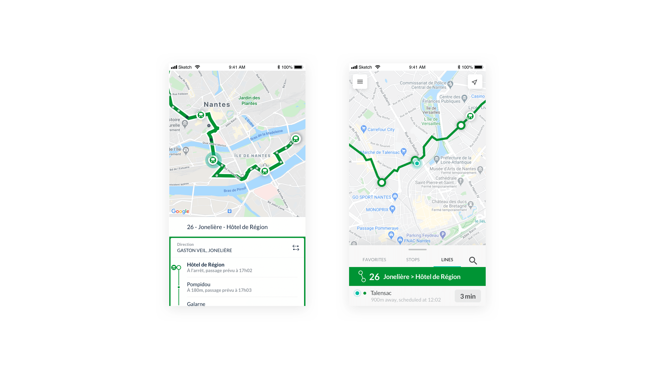
So we preferred to remove the past buses and only leave the next bus that will pass to be displayed on the map, and it is in the bottom sheet that he will be able to see all the timetables of the next buses to come. The user will then be able to find out where his bus is more quickly, without unnecessary information.
Loading time - 2nd sprint
Today, 1 minute loading time to launch an application is far too long, even more so when it is a transport application where speed of service is essential. However, we could not work on the technical part of the application nor on the database.
It so happened that at launch, the application was systematically loading all the bus networks worldwide that use the zenbus gps tracking system. It was very heavy in data and useless for the users to have all of this. It also means that the more Zenbus develops, the more transport networks it will cover, the longer the application will take to load, which is not a viable long-term strategy.
The solution found was to use the geolocation of the user to propose the networks in his vicinity. Then the chosen network will be loaded by default each time the application is launched, if the user wants to consult another transport network he will have to go to his parameters to modify his default network.
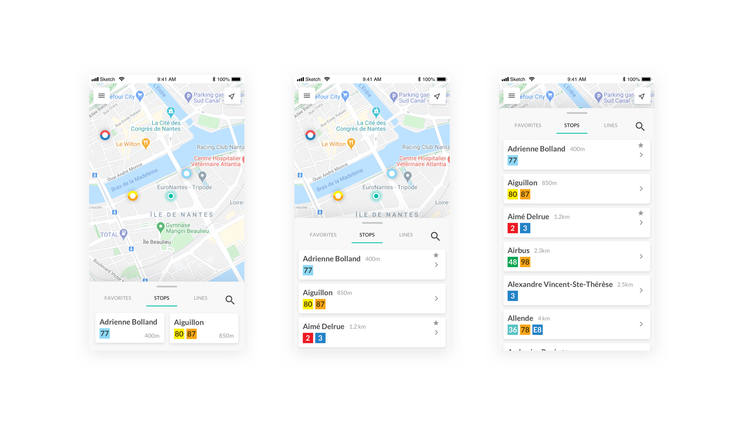
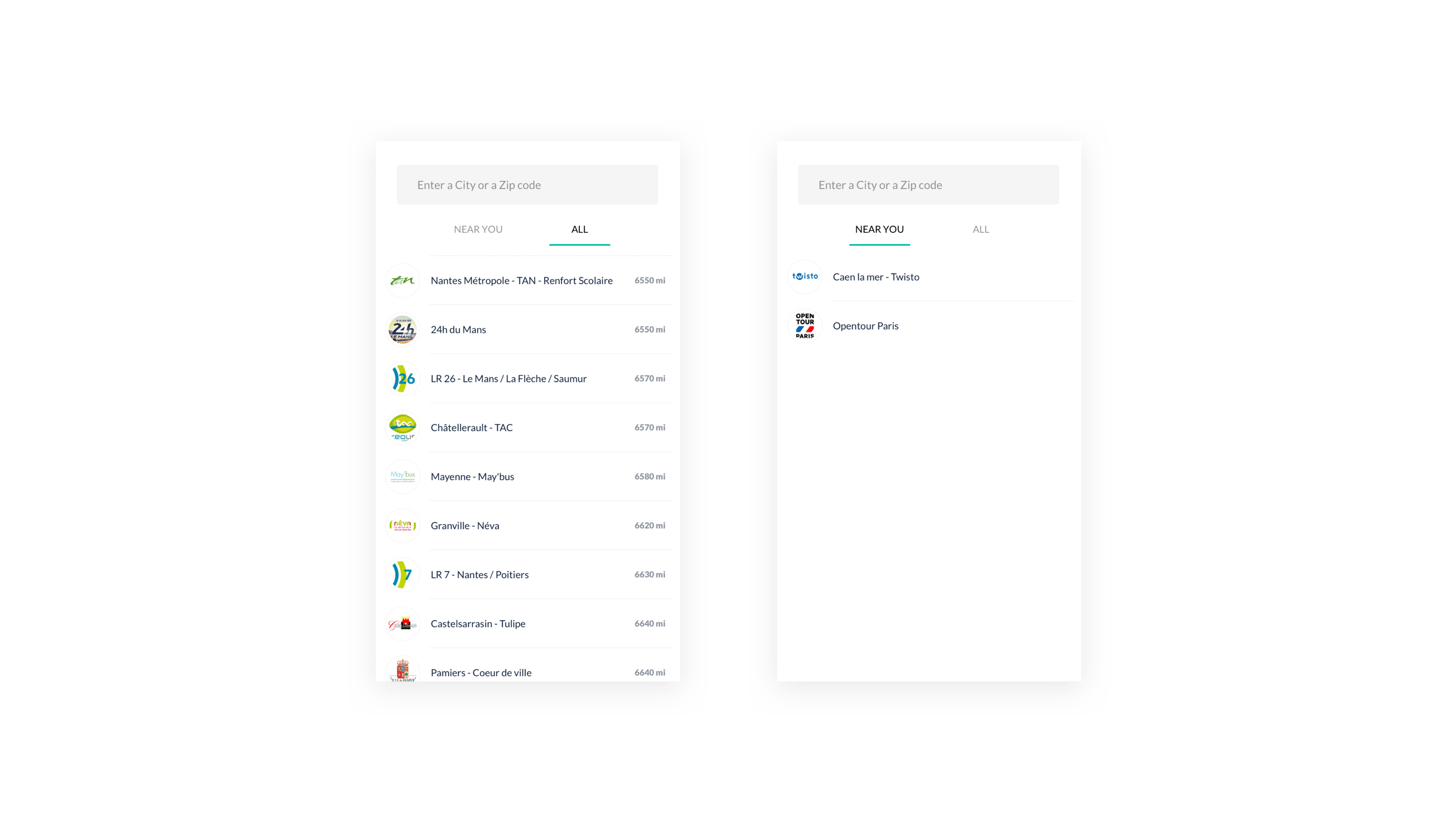
Favourites Tab - 3rd sprint
To find out when the bus was going to pass, the user had to click on his line in the bottom sheet mode, then find his stop, and then look on the map to see where his bus was, for us it was a few clicks too many.
We preferred to make 2 tabs in the bottom sheet:
• a lines tab which lists all the information on the bus lines, the stops on the lines, their destinations, the number of buses in circulation, their timetables and departures.
• a stops tab which lists only the bus stops, the timetables relating to these specific stops, all the different bus lines that pass through them and the disturbances concerning them.
This separation makes sense because we have devised a system of favourites, so that users who go to a specific stop every day can bookmark their stop and thus only be warned of information concerning that stop.
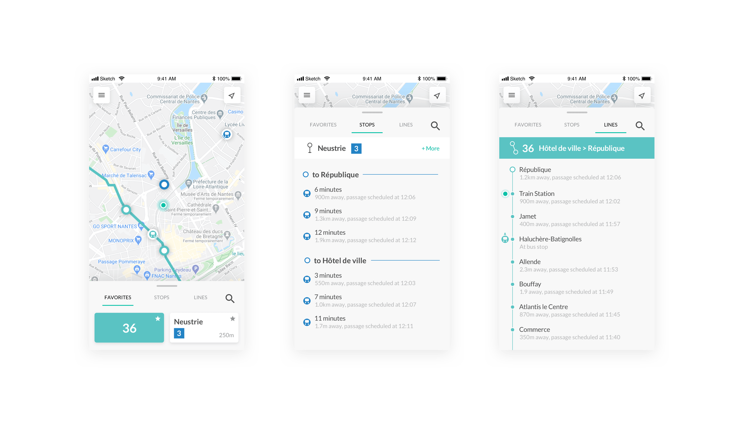
In addition, a system of notifications has helped to improve the experience. When you always take the same bus at the same stop, you can set this stop as a favourite and a time when you want to catch it every morning.
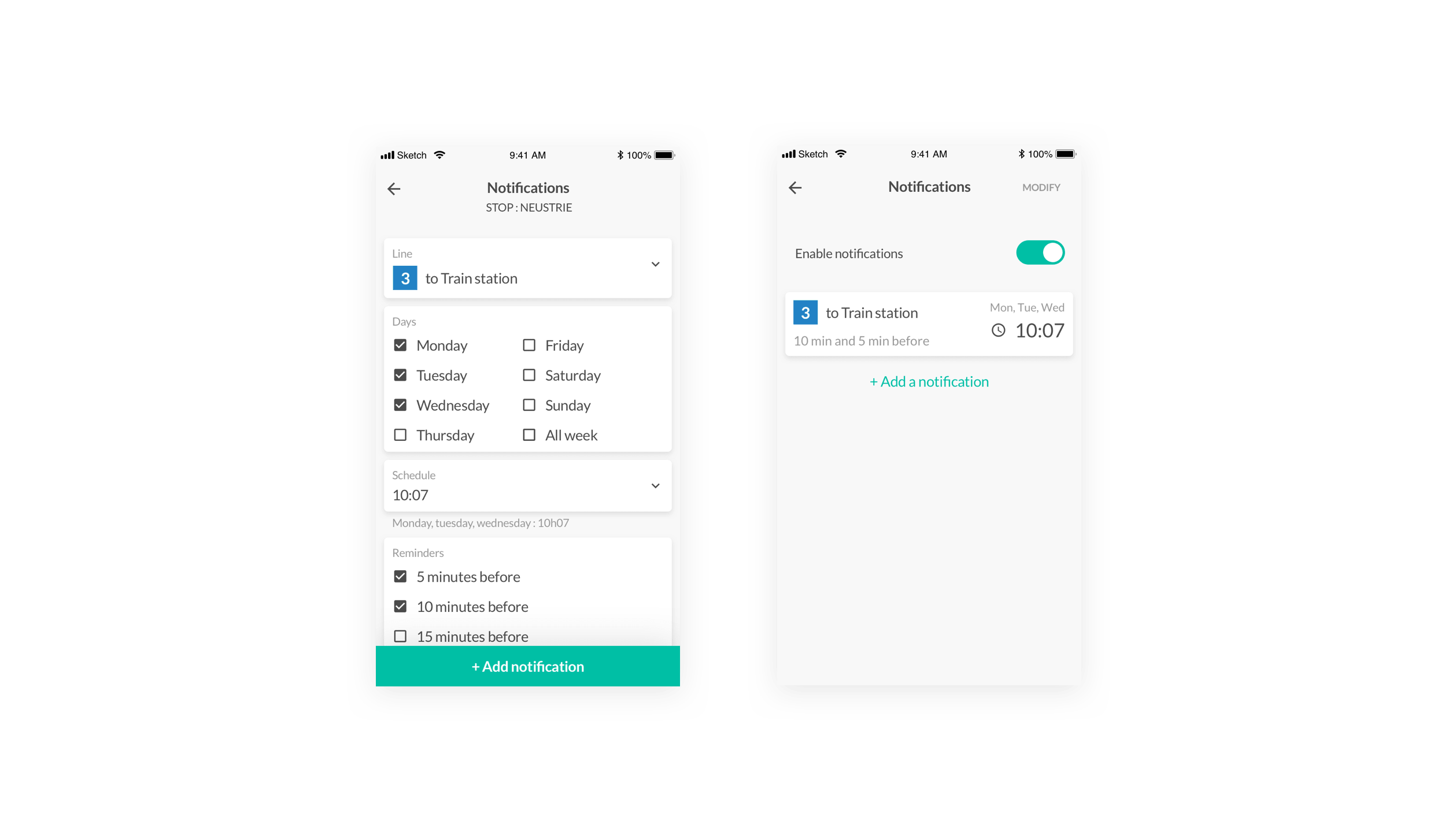
If you take bus 3 which passes at 10:07 am at the Neustrie stop, zenbus will send you an automatic notification 10 minutes ahead to warn you of the delay or advance of your bus so that you don't miss it: "Your bus is a little early and should arrive at the stop at 10:03 am".
Usability testing
We tested our new interfaces to see if our choices were intuitive for users of the Zenbus app. We used Maze, a tool that allowed us to test our prototype with real users and get quantifiable insights we can act on instantly.
• The first mission: Add a stop to favorite and set a notification for a bus
The task is to add a bus stop as a favorite and then set a notification that will warn us of the passage of bus 36 at 10:07 on Monday, Tuesday and Wednesday.
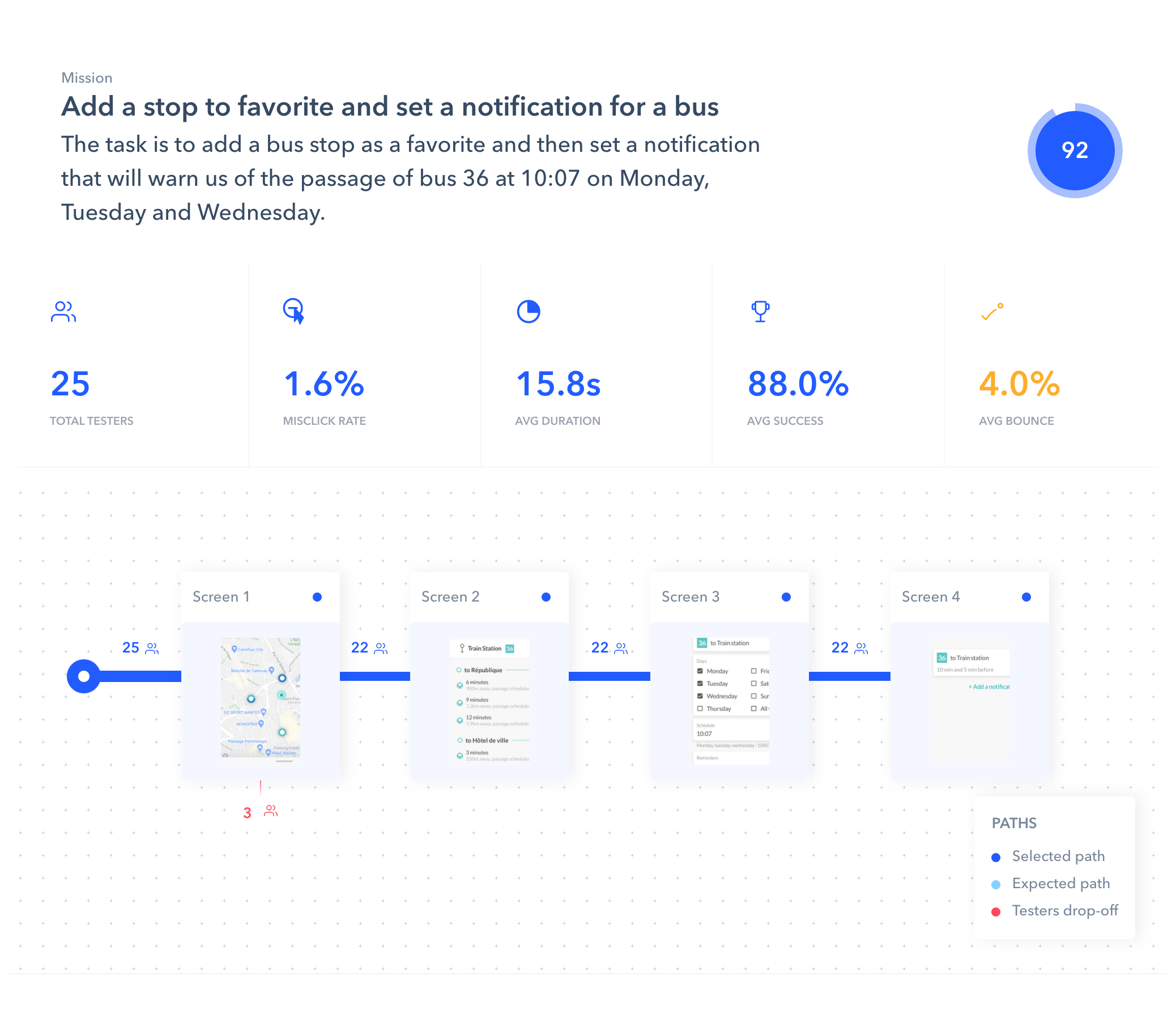
This mission included 2 new features that we had imagined, favourites to easily find your regularly used lines and stops and notifications so you don't miss your regular bus. This mission tested on 25 users was a success as 22 of them used the desired path, 2 used an alternate path and only 1 user failed to complete the mission.
• The second mission: Consult the timetable of the next bus line 64, which passes at the Republic stop
This mission is the most executed task on the application, which is to look at how much time the next bus passes at the stop we are at. This time it is a faultless one as all 25 users managed to find this timetable with the 2 possible paths.
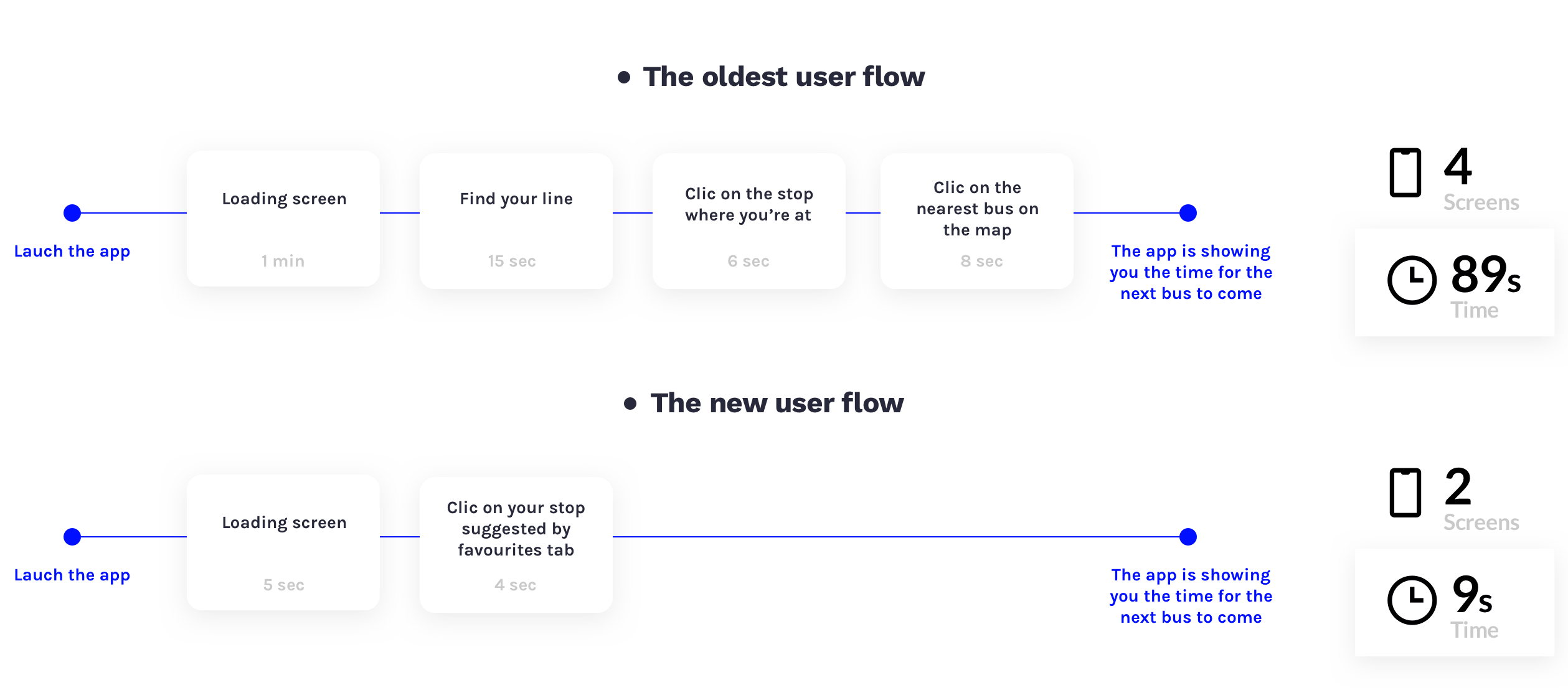
With this new architecture we have observed an enormous time saving between the old interface and the new one, which is an important step forward as it is the main task.
Conclusion
Personally
This project found its richness with the agile methodology, which allowed us to work efficiently as a team and in collaboration with the zenbus team and users of the application. A concrete project that forced us to make an informed design and documented user tests rather than a design by intuition and speculation. The test phases allowed us to make final adjustments to provide the best possible user experience.
Today
We were the Zenbus jury's firm favourite and all our functionalities were integrated into the Zenbus application during the February 2019 update, one month after the end of the project.
In 2018, the application had 15,000 users per month for 100,000 sessions, meaning that they launched the application 100,000 times. After the february update, by the end of 2019, it had 45,000 users per month worldwide for 600,000 sessions. This increase in the number of users shows that a user-based design process can better meet user expectations, resulting in greater use of the service.